Brainstorming Dinner Party Decor

My dad will be visiting next week to do press for his new book, Payback Time, which is coming out March 2 (click here to pre-order on Amazon – sorry to plug it, but I’m excited!).

We’re going to have some wonderful family friends over for dinner, and I’m brainstorming my table design. I’m not really sure what I want, exactly. I don’t want it to look girly, but I do want it to look pretty, and I feel in the mood to spice up the table with a print by wrapping vases.

Snippet and Ink

Snippet and Ink

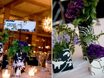
Like these vases, I’m almost feeling a simple and elegant black and white theme, on a white tablecloth with fluffy white flowers and black placecards. It’s a sophisticated color scheme and it won’t compete with the food. A little cold, though?

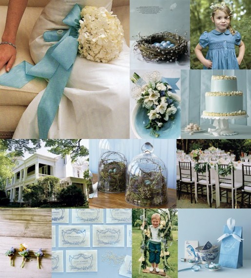
I have lovely ice blue- and pewter-colored placemats that go really well with my dark wood dining table. I could design around them, with silver candlesticks and maybe chocolate or bronze wrapping on the vases, fluffy white flowers, white napkins with chocolate placecards tucked into them. It would be a color scheme similar to this inspiration board, though less embellished wedding and more birds nest with blue eggs and white accents.

Snippet and Ink

Snippet and Ink

I love that lightish bronze color of the birds nest.

I’m going to see what wrapping paper is on offer at the paper store and go from there . . .

Email or Share This Post

Black and White Inspiration

Something about these simple stark white hydrangea bunches against the black dresses is really inspiring me – except as accent colors, black and white are so rarely used on tables.  How fun would it be to have such a dramatic table?

Bonnie Tsang on Snippet and Ink

I LOVE white hydrangeas.  I love all hydrangeas, truthfully, but white ones are so versatile, soft and welcoming.  Using them or another fluffy flower like peonies, rather than a  a more delicate flower like white orchids or roses, will lend the black elements on the table some softness that keeps it from being too stark and Sixties mod.  It’s such a harsh color scheme that I would further soften it by adding wide black ribbons to the vases with big bows and long trailing ends.  Rather than a black or white tablecloth, which would make the table too light or too dark, black napkins draped over the side of the table as placemats would add the black element without overwhelming the entire table, and white plates over them would balance the darkness.  For accent colors, I’d like some gold – perhaps a few burnished gold candlesticks with white taper candles on the table – and a little greenery either in the vases or place cards.  I LOVE these simple pear place cards.  So fall-y and simple, and absolutely gorgeous.

The presentation and style of food could either lean towards the more simple and modern if you want to accentuate the clean lines and stark colors of the table, with a carefully presented salad followed by a simple piece of fish.  Or, you could contrast with the table and warm it up with comfortable food such as roast chicken.  Both could end with homemade passed truffles, which will look beautiful on the black and white table (and I just really want to make them!).

More Modern Menu

More Homey Menu

Related Posts with Thumbnails